Retail packaging for a waterproof bag fights a war the product never sees: the three seconds a shopper’s eyes spend scanning a shelf of forty rivals. The bag inside may be objectively superior — better fabric, better welds, better warranty — and lose the sale to a louder box, because at shelf distance the packaging is the product. Packaging design for retail is therefore a commercial discipline with its own rules: an information hierarchy engineered for distance, a structure that survives the supply chain, and a compliance layer that satisfies the channel’s gatekeepers.
This guide is written for brands placing waterproof bags into physical retail — outdoor specialty, big-box, club and gift channels — and for the factory conversations that follow. QUANZHOU JUNYUAN BAGS: custom waterproof bag production since 2014, 4,950 m² SGS-verified facility. We execute retail packaging programs to buyer specification, from hangtag-and-polybag minimums to full boxed presentations with display trays.
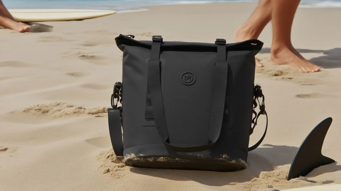
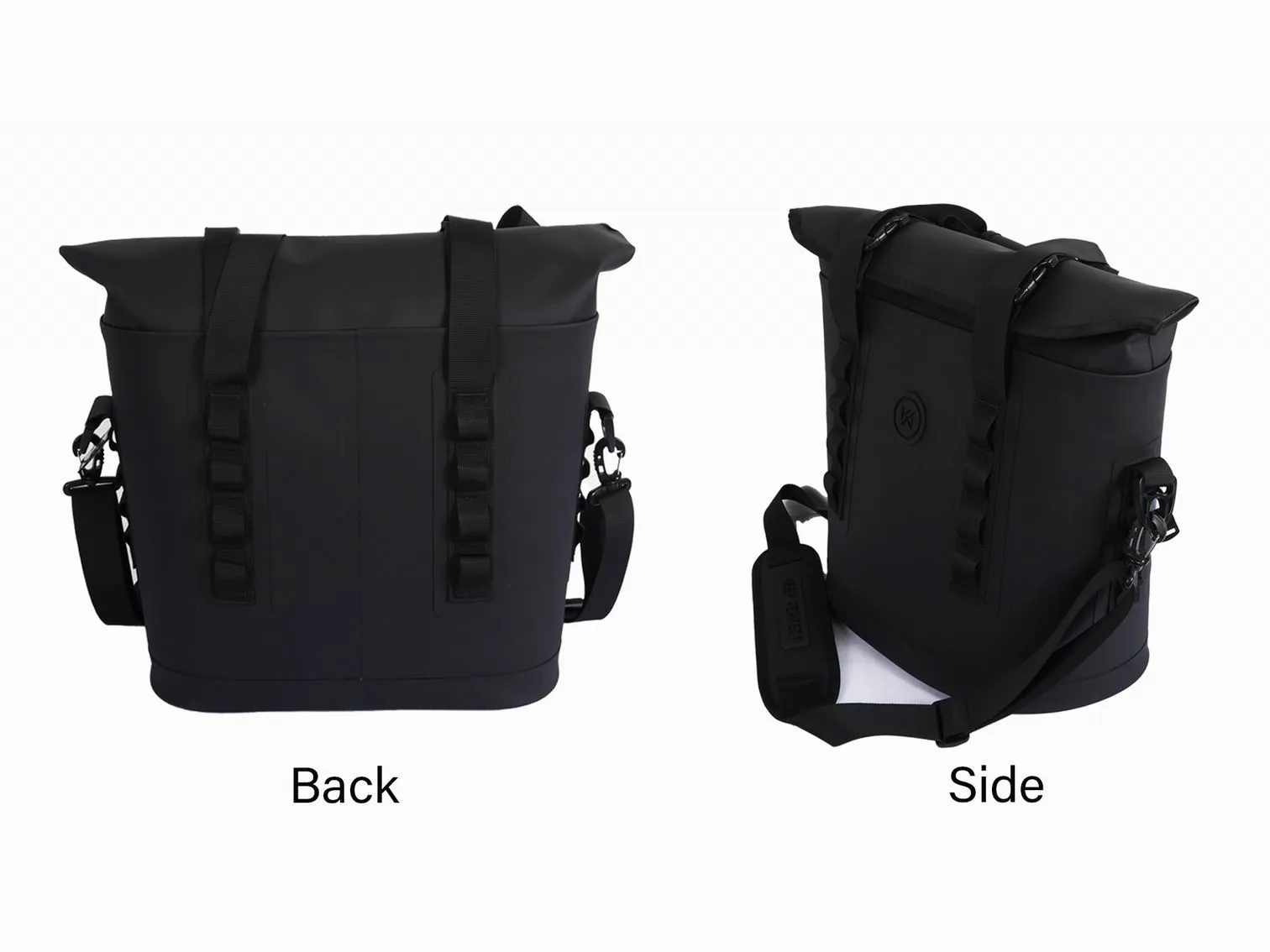
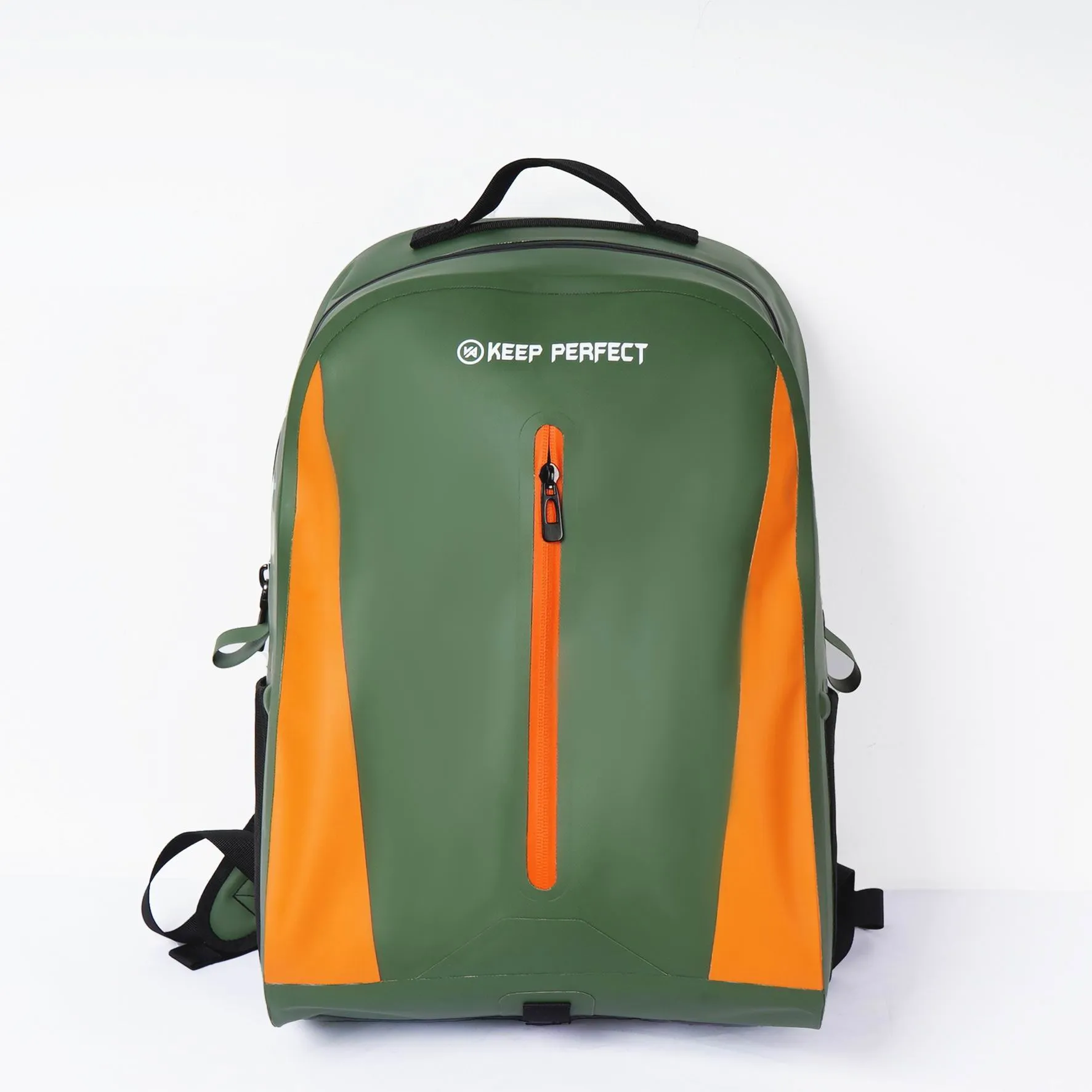
The three-second test: how shoppers actually see packaging
Eye-tracking research on retail shelves converges on an uncomfortable number: a package gets roughly three seconds of consideration before the shopper’s gaze moves on, and within those seconds it must answer three questions in order — what is it, who is it for, why this one. Packaging that fails the first question never gets asked the third. This is why the front panel of a waterproof bag package is not a canvas for everything the brand wants to say; it is a triage of what the shopper needs to know, sequenced by reading distance.
The practical hierarchy works in three distance bands. At three meters — shelf-scanning distance — the shopper reads only the category signal: a product photograph or silhouette that says "waterproof bag" instantly, plus a color block that differentiates the brand. At one meter — the step-closer distance — the shopper reads the single hero claim: "submersible to IPX8" or "keeps ice 24 hours," one line, never two. At hand distance — the package picked up — the full information architecture takes over: features, sizes, proof points. The design failure that kills most outdoor-product packaging is reversing this order: hero claims designed for hand distance placed where only three-meter scanning happens, rendered invisible by small type and low contrast. A numeric hero claim also has to be true: the IPX8 code on the front panel is defined in IEC 60529, published by the International Electrotechnical Commission, and the depth and duration behind it belong in the test file the brand keeps.
Information architecture: front sells, back closes
The front panel carries five elements and no more: brand mark, product identity (a photograph of the actual bag, not an illustration), the one hero claim, the one technical proof point that substantiates it (the IP rating, the hour rating, the liter capacity), and the size or variant identifier. Every additional element on the front panel measurably dilutes the others — the discipline is deletion, not addition. Waterproof bags enjoy one structural advantage here: the category’s proof points are numeric and verifiable, and numbers stop the eye better than adjectives. "IPX8" outperforms "totally waterproof" at shelf distance every time.
The back panel is where the considered purchase closes, and it should be organized for a shopper standing in an aisle holding the box for twenty seconds. The proven structure: a short use-case block (three scenarios with icons — kayak, commute, beach), a feature list written as outcomes rather than specifications ("phone stays dry in a capsize" rather than "welded seams"), a contents-and-sizing block, and the trust layer — warranty terms, certifications, country of origin, and a QR code to a setup or sizing page. The packaging options guide covers what these components cost and which minimums they carry; this guide covers what they should say.
Structural design: three masters, one box
Retail packaging structure serves three masters with conflicting demands. The shelf wants a consistent facing — a front panel that presents flat and full, in a footprint that fits standard shelf depths and peg hooks. The supply chain wants density and survivability — boxes that stack to full pallets, survive clamp trucks and container humidity, and pass the parcel-network drop sequence if any unit ships direct. The customer’s hands want an honest opening experience — a box that opens without destroying itself, reveals the bag in a way that photographs well, and re-closes for returns.
| Structural choice | Shelf performance | Supply-chain cost | Best channel |
|---|---|---|---|
| Folding carton (tuck-end) | Clean facing, lightweight | Lowest; ships flat to factory | Specialty retail, e-commerce |
| Rigid setup box | Premium presence | Highest; volume-heavy, slow to pack | Gift, premium electronics-adjacent |
| Belly band on folded bag | Product-visible, honest | Low; no box at all | Outdoor specialty, eco positioning |
| Blister / clamshell on card | Peg-display ready | Medium; plastic stream burden | Big-box accessories walls |
| PDQ display tray | Self-merchandising | Density -30-50% | Club stores, promotions |
The belly band deserves emphasis for waterproof bags specifically: the category’s materials are the message, and a folded bag whose fabric and welds are visible and touchable converts better in specialty retail than the same bag hidden in a box. Outdoor specialty staff — the employees who actually recommend products — consistently prefer packaging they can open and repack in front of a customer. Structure that helps the salesperson sell is a channel strategy, not a packaging aesthetic.
Color, photography and the category codes
Every retail category has visual codes shoppers use for pre-conscious sorting, and waterproof bags sit at the intersection of two: outdoor gear (earth tones, technical photography, spec-forward type) and marine/watersports (high-chroma blues and oranges, action photography, lifestyle-forward type). The strategic choice is which code to claim. A fishing-market dry bag dressed in outdoor-earth codes looks serious; the same bag in marine-chroma codes looks fun. Neither is wrong — but the channel decides. Big-box sporting goods shelves run outdoor codes; coastal and boat-channel retail runs marine codes; gift channels run neither and reward restraint.
Photography discipline matters more than photography budget. The package photograph must show the actual product in the actual color — a rule that sounds obvious and is violated constantly, producing returns and one-star reviews when the box shows a matte black bag and contains a glossy one. Color-managed printing is the unglamorous enabler: the photograph is proofed against the physical bag under the same light, and the print run is checked against the approved proof, not against the monitor. Bags with glossy TPU faces are the hardest to reproduce honestly, and gloss-varnish tricks on the box that fake the sheen are a proven returns generator.
Channel rules: specialty, big-box, club and gift
Each retail channel enforces its own packaging regime, and designing before knowing the target channel wastes the design. Outdoor specialty tolerates — even rewards — minimal packaging: belly bands, hangtags, visible product, and staff-friendly openability. Big-box retail runs on planograms: the package must fit a defined shelf or peg footprint, carry a scannable UPC in a defined position, survive a defined distribution-center drop test, and increasingly meet a packaging sustainability scorecard. Club stores buy display trays, not packages: the PDQ tray is the selling unit, and the individual package inside can be nearly bare. Gift channels buy presentation: rigid boxes, ribbon-ready surfaces, and silence about technical specifications.
The multi-channel trap catches growing brands: one package asked to serve specialty, big-box and e-commerce simultaneously, compromised into serving none well. The disciplined answer is a common core with channel skins — one printed insert and bag presentation that works everywhere, with channel-specific outer elements: a belly band for specialty, a tuck-end box for big-box, a mailer for e-commerce. The factory conversation this produces is exactly the tiered menu in our custom packaging options guide, and the sustainability scorecard dimension is mapped in packaging sustainability for brands.
Typography and the legibility budget
Type on packaging obeys a legibility budget that designers ignore at the brand’s expense. The hero claim must survive the worst conditions it will ever meet: a forty-year-old eye, at three meters, under store lighting, possibly through the polarized sunglasses the customer forgot to remove. That translates to unglamorous rules — a minimum x-height that works out to roughly 25mm cap height for three-meter reading, a contrast ratio that holds when the box sits in shadow on the bottom shelf, and a typeface with enough weight that halftone printing on corrugated does not fill in the letterforms. Thin, elegant typefaces that look sophisticated on the design monitor die on the shelf.
The bilingual question hits waterproof bags early because the category sells across borders: English and French for Canada, English and Spanish for the US Southwest, multi-language panels for EU distribution. The wrong answer is shrinking the primary language to make room; the right answer is architectural — one language owns the front panel per market variant, with secondary languages on the back and side panels, or a dedicated multilingual SKU for the markets that require it. Retailers in regulated markets reject packages where required-language information is illegible, and "legible" has published minimum type sizes in several jurisdictions. The print run for a multilingual variant is a separate plate and a separate minimum, which belongs in the cost conversation from the packaging options guide.
Sustainability as a shelf message: proof over posture
Packaging sustainability has crossed from back-office scorecard to front-panel message, and the shelf rules are the same as for any other claim: specific beats vague, verified beats asserted. "Made from 100% recycled paperboard" with an FSC-Recycled mark converts; "eco-friendly packaging" converts nothing and increasingly invites regulatory attention under green-claims rules in the EU and several US states. The waterproof category has a genuine story to tell — a durable, repairable product in minimal packaging is an honest contrast to disposable goods in elaborate boxes — but the story must be told in certifiable lines, not adjectives.
The structural decisions carry the message further than the ink. A belly band instead of a box, a single-material paperboard carton with water-based coating instead of lamination, molded-pulp instead of plastic inserts — each is both a footprint reduction and a visible signal the shopper can verify in hand. The full menu of sustainable options, their cost deltas and their certification marks is mapped in our packaging sustainability guide; the design rule here is simpler: make one structural sustainability decision the shopper can see, name it on the panel in one certified line, and leave the adjectives off the box. Retail buyers now ask the verification question in the first meeting, and the package that answers it with a certification mark instead of a paragraph wins the slot.
The compliance layer on the artwork: what the box must carry
Retail artwork finishes with a compliance pass that is easier to build in than to retrofit. The mandatory elements for a waterproof bag selling into North American and EU channels: the UPC or EAN with its quiet zones intact and a verified scan grade; country of origin in the required wording and location; the polybag suffocation warning where a bag component is present; care and safety language the channel requires; and any certification marks — FSC, recycled content — used strictly within their license terms, because misused marks are a legal exposure, not a design choice. Retail vendor guides add channel-specific marks: price tickets, RFID tag placements at some big-box accounts, and the club channel’s tray-label formats. Behind the EU half of that list sits a single framework: the European Commission’s consumer protection law sets the rules on labelling and claim substantiation that a retail compliance team enforces, and it is cheaper to read before artwork is locked than after the truck arrives.
The artwork handoff is where compliance most often breaks: the designer exports final files without the compliance layer, the printer plates what they receive, and the missing warning is discovered by the retailer’s compliance team after the truck arrives. The discipline that prevents it is a one-page artwork checklist — every mark, its size, its position, its language — signed by the person who owns regulatory responsibility before files go to print. Ten minutes of checklist beats a container of relabeling, and the checklist becomes a standing document: every subsequent variant inherits the layer instead of reinventing it.
The retail audit: testing the package before the buyer does
Retail buyers evaluate packaging with a practiced eye in a ten-minute meeting, and their checklist is knowable in advance: does it read at shelf distance, does it fit the planogram, does it survive the distribution system, does the sustainability story survive a question, does the price point match the presentation. Brands can run the same audit before the meeting. The shelf test: photograph the package on an actual competitor shelf (a store walk with a phone) and look at the thumbnail — if the category and hero claim do not read at thumbnail size, the hierarchy failed. The drop test: ship three packed units to yourself by the cheapest parcel service and open them critically. The question test: hand the package to someone outside the industry for twenty seconds and ask what the product is and why it costs what it costs.
The factory’s role in the audit is the pre-production packed sample — the complete retail unit produced on the actual line with the actual materials, approved before the print runs and bulk packing begin. A packaging program that skips this step discovers its failures at container scale. Six lines close the design file: front panel triaged to five elements, hero claim numeric and verifiable, back panel structured for the twenty-second read, structure chosen per channel, photography color-managed against the physical bag, and the whole unit sampled and audited before bulk — executed by a factory packing 200,000 pieces monthly, sampling in 6–10 working days, bulk 35–50 days, FOB Xiamen, SGS-verified, documented end to end.
Frequently Asked Questions
Q1. What makes waterproof bag packaging sell at retail?
A front panel that answers three questions in three seconds — what is it, who is it for, why this one — with a numeric proof point (IP rating, ice-hours, liters) as the hero claim. Numbers stop the eye better than adjectives.
Q2. How many elements belong on the front panel?
Five, no more: brand mark, actual product photograph, one hero claim, one technical proof point, size identifier. Every additional element dilutes the others — the discipline is deletion.
Q3. Box or belly band for a waterproof bag?
Belly band for outdoor specialty — the fabric and welds are the message and staff sell better with touchable product. Box for big-box, gift and e-commerce — where protection, planogram fit and unboxing matter more.
Q4. What do big-box retailers require in packaging?
Planogram-compatible footprint, UPC in a defined position, a distribution-center drop-test pass, and increasingly a sustainability scorecard submission. Requirements arrive in the vendor packaging guide — get it before designing.
Q5. Should the package photo show the real product color?
Yes — photographing a different colorway or faking gloss with varnish tricks is a proven returns generator. Color-manage the print against the physical bag under matched light.
Q6. What is a PDQ tray and when is it needed?
A product-display-quick tray — a printed corrugated tray holding 12-24 units that club stores drop straight onto the floor. Needed for club-channel programs; it becomes the selling unit and cuts pallet density 30-50%.
Q7. How do I test packaging before a buyer meeting?
Three tests: photograph it on a real competitor shelf and check the thumbnail; parcel-ship three units to yourself and open critically; hand it to an industry outsider for twenty seconds and ask what it is and why it costs that.
Q8. Can one package serve specialty, big-box and e-commerce?
Not well — the channels want different structures. The disciplined answer is a common core presentation with channel-specific outer skins: belly band for specialty, tuck-end box for big-box, mailer for e-commerce.
Q9. Where does the barcode go on retail packaging?
Lower right of the back or bottom panel in most vendor guides, on a flat surface with quiet zones, at least 80% of nominal size, and scanner-verified on the production sample — never assumed from the artwork.
Q10. What does the back panel need to close a sale?
A three-scenario use-case block, features written as outcomes, contents and sizing, and the trust layer — warranty, certifications, origin, QR code. Organized for a twenty-second read in the aisle.
Q11. How much should retail packaging cost as a share of product cost?
Four to eight percent of landed cost fully loaded for boxed retail programs, including the freight delta from lower pallet density. Above ten percent the packaging is usually over-built for the price point.
Q12. What is the most common retail packaging failure?
Designing for hand distance instead of shelf distance — small type, low contrast, hero claims invisible at three meters. The second most common: discovering the planogram footprint after the boxes are printed.
People Also Ask
What should waterproof bag packaging say on the front?
Five elements: brand mark, actual product photograph, one hero claim, one numeric proof point like IPX8 or liter capacity, and the size identifier. The front sells in three seconds; the back closes in twenty.
How do I design packaging for big-box retail?
Start with the retailer’s vendor packaging guide: planogram footprint, barcode placement, drop-test standard and sustainability scorecard. Design inside those rules, then differentiate with the information hierarchy and color blocking.
Is minimal packaging acceptable for outdoor retail?
Yes — outdoor specialty rewards it. Belly bands, hangtags and visible product convert better in specialty channels because staff can open, demonstrate and repack in front of customers. Save the box for big-box, gift and e-commerce.
What is the three-second test in packaging design?
The window a shopper’s gaze gives each package while scanning a shelf. In those seconds the package must answer what it is, who it is for and why this one — which is why hero claims must read at three-meter distance.
How do club stores handle waterproof bag packaging differently?
Club stores buy PDQ display trays as the selling unit; the individual package inside can be nearly bare. The trade-off is pallet density dropping 30-50%, which belongs in the program’s landed-cost math.
Should packaging photography match the actual bag color?
Exactly. Color-manage the print against the physical product under matched lighting, and approve a production printed sample — not a monitor proof. Mismatched photography is a leading cause of retail returns and negative reviews.